

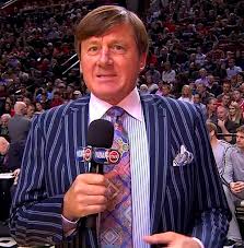
Ok. I’m gonna go out on a limb here and risk alienating the rabid female fanbase this blog has developed over the course of the last few months. Basically, since inception. Johnny Depp is not only one of the most overrated actors of our generation (no, Sweeney Todd does not classify as a film!), he also has a horrible dress sense. While he may have looked somewhat respectable in this article’s title namesake, take one look at him in Alice in Wonderland and you’d run for Neverland. And no, don’t even try and blame it on the costume designers on set!

I’ve emphasized it in an earlier article, matching tie colors and patterns, and I will hammer home the point here again. Color coordination is vital. Not everyone here is going to opt for off the rack purchases. And that’s fine. Wear a bespoke outfit, with horrible color coordination, and you may as well stay at home waiting for the Red Sox to win another World Series. i.e, an eternity! Buy off the rack, and while the fit may not be perfect, coordinate your colors well, and your good to go!
So what color codes should we pay attention to when dressing up, or dressing down, for that matter?
When we dress, we want to produce a sense of harmony. This ensures that our color scheme is pleasing to the eye, and is not too chaotic. If, on the other hand, we try and do too much with mixing and matching of colors, we may end up with a final look that is overload on the visual senses. Case in point:
When dressing up, or down, there are both core colors and accent colors involved:
Core Color is the dominant color in a color scheme. It’s the color of a principal item in your attire, such as a suit or a sweater.
Accent colors are secondary colors and sometimes tertiary colors used in a color scheme. Accent colors may be complimentary, triad, analogous or neutral.

Different color schemes
Complimentary colors are directly across from each other in the color spectrum, such as red and green here. It’s also a reason why blue and rust (ie. darker orange) is a popular color combination. A navy blue suit with a light blue shirt and a rust tie can look immaculate!
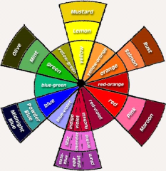
Tints and Shades of different colors
Triad Colors take into account colors that are equidistant on the color wheel (e.g blue, yellow and red). A navy blue suit could pair well with a pink shirt and a maroon tie, or a light yellow shirt and a burgundy tie. The key is to vary the intensity of the colors. You can generally discern if certain colors are too bright. So a deep blue with a bright yellow shirt and a bright red tie might cause havoc and be visual overload! Unless, of course, you want to dress like him:
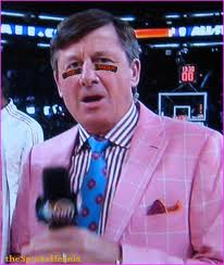
Cash Money
Analogous color schemes work well if you want to go for something a little bolder than a monochromatic look but not contrast too heavily. A brown (neutral color) suit with a lilac shirt and a purple tie could work in this case.

Split complimentary allows you to contrast without such a bold statement. So instead of pairing blue with orange, you could pair a blue shirt with a yellow-orange or red-orange tie.
‘Warm’ and ‘Cool’ colors
Another factor to consider when mixing and matching colors is to balance out ‘warm’ and ‘cool’ colors. Warm colors (red, orange and yellow) are associated with fire and sun. Cooler colors (blue, green, indigo) are associated with calmness and foliage. Balancing out one warm color with two cool colors or the other way around is a great way to create harmony. Personally, I would rather go with two cool and a warm (e.g navy blue suit, light blue shirt and a red tie). Or a neutral colored suit, such as a charcoal grey pinstripe suit, with a light blue shirt and a pink tie (pink is a variant of red, which is warm).
Finally, try and take into account the season in which you are dressing for! Some colors are more appropriate at certain times of the year than others. For example, pastel (like a light yellow or pink) are usually associated with the summer, while fall colors are rust, brown, green and burgundy hues. Wearing rust in the summer or light yellow in the fall can sometimes look out of place.
And that's a wrap for this one! We hope that you've enjoyed learning about tie coordination as much as we did writing it.
Still not sure of how to mix and match your accessories? No problem! We at The Dark Knot are here to help. We now offer a full wardrobe consulation service. Want to preview our accessory selection? Click here.


