
How To Match Ties To Your Suits & Shirts
Are you looking for a set of foundational ties for your wardrobe? Feel free to check out The Dark Knot's Essential Ties Collection!
The art of matching ties to your suits and shirts is something that has confounded the best of us for years.
We grew up watching sports, movies and reading about sexy swimsuit models. We played basketball and attended football games. But never, did we learn about color theory or recognizing what clothes match with what articles. We just had no idea. Neither did we seem to care.
Until we realized this all important truth; Evolving into our highest potential as a gentleman requires paying attention to finer details in life. And one of those happens to be clothing.
Generally, the closer a layer of clothing is to our body, the easier it is to match. Take a layer or two away, and matching suddenly becomes a much more arduous task. We now have layers beneath to match and contrast against, and we are all of a sudden dumbfounded.
In creating this content, I would like to point out three critical components to pay attention to when matching ties to your suits and shirts. These should help you navigate through this article better and help you maintain a sense of what is important when choosing ties that best match your suits and shirts.
- Color theory
- Pattern mixing
- Tonal considerations
1. Color Theory: Matching Tie Colors to your Suits and Shirts
The first component of matching ties is color. Color may seem arbitrary to many of us. Hence, the color wheel. A color wheel is a great foundation for understanding color. It is largely divided into two camps. Warm and Cool Colors.
Warm colors exhibit vibrance, such as red, orange and yellow. Cooler colors are associated with calm, such as blue, green and purple. The concept of a color wheel allows us to harmonize colors. Harmony is the process of creating a balanced look.
As we will see below, what creates ideal color harmony is a situation where we have a warm color set against a cool color, hence creating visual contrast and an element of pop, something that we would all like to achieve when strutting our latest suit, shirt and necktie ensemble.

As mentioned above, the color wheel largely divides colors into two camps, warm and cool colors. Using a color wheel, we can create color schemes that will help us achieve the all important concept of harmony. Below is a list of the major color schemes working from schemes with lower intensity and contrast to the boldest color schemes.
The Dark Knot Tip: When first starting out with matching ties to your suits and shirts, it is best to work with the color schemes below listed first and to gradually work your way up to a complementary (boldest) color scheme.
Monochromatic color scheme
This is the easiest way to start experimenting with color and also the most conservative color scheme. A monochromatic color scheme matches darker variants of a color with lighter variants e.g a navy tie against a light blue shirt or a burgundy tie against a light pink shirt. This will allow you to look elegant and sophisticated, without necessarily taking you out of your comfort zone.
A monochromatic scheme is a safe and easy way to look dapper and can be used in any setting, from work, to presentations, meetings and even more formal social settings such as a wedding

The Dark Knot's Domaso Grenadine Navy Silk Tie set against a light blue shirt!
Analogous color scheme
The next progressive step for the aspiring dapper gentleman, an analogous color scheme is one step bolder than using a monochromatic color sequence. This color combination involves choosing adjacent colors on the color wheel. While this generally means wearing tie colors that are either cool or warm colors, and hence not introducing harmony yet (warm and cool color balance), this does introduce an element of sophistication without being overtly bold.
Examples of this include wearing a purple tie with a blue shirt, or an olive green tie with a blue shirt! Analogous color schemes are soothing to the eye, and hence can be used at work or in more social settings!
The Dark Knot's Shelton Abstract Purple & Navy Geometric Foulard Silk Tie pops off perfectly against this finely striped lighter blue shirt!

Triadic Color Schemes
A Triadic Color Scheme involves choosing colors that form a triangle along the color wheel. Finally, we now have a color scheme that involves harmony (creating a balance between warm and cool colors). Hence, triadic color schemes are blue, red and yellow and green, orange and purple. While both of these color schemes involve both warm and cool colors, the contrast is not as strong as with a complementary color scheme. This slightly muted, but highly attractive color scheme, is a great way to introduce color into your wardrobe.
For almost all men, triadic colors are something that they have experimented with in the past. This is why a red tie looks great against a blue shirt, as would a darker, mustard yellow. A triadic color scheme is a highly professional yet versatile scheme, and so can be used at work, in professional settings such as meetings and presentations, and for formal social events such as a wedding or elegant horse race!
The Dark Knot Tip: To pull off an exemplary, stylistic look, as in the case above, have one of the these triadic colors be the dominant color of your tie, and have the color of your shirt as a background color in your tie.
Are you looking for ties that match your suits and shirts? Feel free to check out The Dark Knot's Silk Ties Filtered Search System, where we help you choose ties based on your existing wardrobe and lifestyle needs!
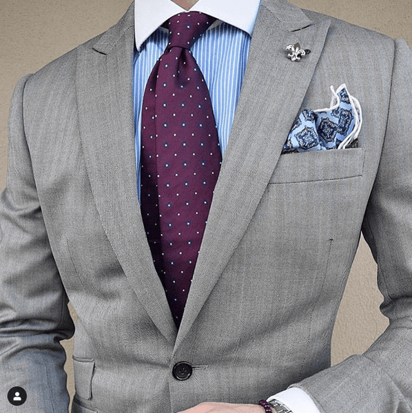
The Dark Knot's Stafford Squares Burgundy / Light Blue Silk Tie stands out exquisitely against this light blue shirt!
Tired of not having ties that perfectly coordinate with your suits & shirts? Fed up of mismatched ties to your suits & shirts? Fret not! - With The Dark Knot's filtered search system, one can find ties based on matching suits, matching shirts & even the type of occasion that you are dressing up for! Never leave your house mismatched again! Please feel free to view our Silk Tie Collection!

Complementary colors
Complementary colors are the most strikingly contrasting colors and are directly opposite each other across the color wheel. Hence, a blue’s direct contrasting color is orange, red’s complementary color is green and yellow’s complementary color is purple. Hence, complementary colors form the strongest contrast. It is best to understand this through the concept of warm and cool colors. Because we are pairing warm and cool colors that offer the strongest visual contrast, these colors also provide the most pop.
Complementary colors are best used in social settings, as their boldness may appear as inappropriate for the work place or more professional settings.

An Orange Knitted Tie against a blue shirt provides for a bold, complementary color scheme! Courtesy of Pinterest (http://www.pinterest.com)
Please feel free to view The Dark Knot's range of ties that match white shirts
Please feel free to view The Dark Knot's range of ties that match blue shirts
Please feel free to view The Dark Knot's range of ties that match grey shirts
Please feel free to view The Dark Knot's range of ties that match pink shirts
Please view The Dark Knot's video on Matching Tie Colors here:
2. Pattern Mixing: Matching Tie Patterns to your Suits and Shirts
Similar to colors, you ideally want your tie pattern to create an element of contrast with the shirt and suit that you are wearing. As a general rule of thumb, when you are starting out, avoid mixing and matching three patterns as it could be overkill, especially if you are unsure as to what you are doing!
Contrary to what most of us originally think, for patterns to be able to pop off each other visually, they do not necessarily have to be different patterns (e.g checks against stripes).
While they can be different patterns, they can also be similar patterns in different proportions. It is absolutely critical that your pattern proportion varies, whether the patterns are similar or different.
If pattern proportions are close to each other, your overall aesthetic will look too cluttered and will do the exact opposite of what you are aiming to achieve.
Please feel free to view The Dark Knot's Tie Unboxing Video, where each silk tie is presented in an elegant black gift box, along with a card with recommendations for matching attire!
These general aesthetic rules apply when choosing an appropriate tie pattern:
1. Pick a pattern that is same in scope but different in proportion.
If you are wearing a solid colored grey suit with a narrow striped blue shirt, a wider striped tie using color theory described above could work very well.
To view The Dark Knot's extensive range of hand made striped silk ties (with a double layered interlining of wool and cotton) that are ideal for your everyday needs at work, be it daily work, a meeting or an important presentation, please click here!

The Dark Knot's Canterbury Regimental Navy w/ Red Tie pops off perfectly against this narrow blue striped shirt. What is critical here is that while the patterns are similar, the pattern proportion between the shirt and tie varies drastically, allowing this combination to work!
2. Pick a pattern that is completely different.
Instead of using wider striped ties, as suggest above, you could use a polka dot tie (polka dot ties invariably are larger spaced) set against your narrowly striped, pinstripe shirt.
Conversely, you could use an abstract design such as a repeating floral patterned tie with some level of spacing relative to the spacing of your striped or checkered shirt. Again, as is the case above, pattern proportion is of critical importance, even when the two patterns are completely different.
Do you need help matching tie patterns to your suits and shirts? The Dark Knot's filtered search option will allow you to choose ties based on tie color, patterns, tie width, matching shirts, matching suits and even the type of occasion that you are looking to dress up for! This extremely valuable tool can be viewed here.

The Dark Knot's larger proportioned Berkshire Abstract Grey Silk Tie pairs perfectly with this smaller proportioned checkered shirt!
3. Matching a Patterned Shirt with a Solid Tie.
As an alternative to the above two methods of matching tie patterns to your shirts you could choose not to contrast the pattern of the shirt with another pattern, and instead contrast it with a solid tie.
Matching a patterned shirt with a solid tie is an effortless way to match a tie to a patterned shirt and can often create just as sophisticated a look as the two pattern matching schemes above!
 The Dark Knot's Waterbury Blue Solid Tie sits perfectly against this striped shirt, creating the perfect combination!
Tired of not being able to find ties that match your suits & shirts. With The Dark Knot's filtered search system, one can find ties based on matching suits, matching shirts & even the type of occasion you are dressing up for! Please feel free to view The Dark Knot's exquisite Silk Tie Collection.

Matching ties to shirts based on pattern scale
Another way of looking at matching tie patterns to your suits and shirts is to see if you are starting with a smaller scaled pattern shirt, a larger scaled shirt pattern, or no pattern at all.
Solid Colored Shirt with Patterned Tie
If your shirt is a solid color, find a tie with the same color in the background. Ideally, avoid wearing a solid tie against a solid shirt. A patterned tie will introduce variety and make your suit and shirt combination look more interesting.
For example, if you are wearing a light blue shirt and want to match it with a striped tie, pick a tie where the less dominant stripe is similar to that light blue. This is one of the simplest ways to pair a tie with a solid shirt, and will ensure that you look dapper.

The Dark Knot's Berkshire Abstract Deep Purple Silk Tie pairs perfectly with this light blue shirt.
Smaller scale shirt with a larger patterned tie
If your shirt pattern is smaller in scale, you can wear a bold, patterned tie. This will contrast well with your subdued shirt pattern and create great contrast. Here, your tie will be your statement piece.

The Dark Knot's Fall River Pink & Grey Foulard Medallion Silk Tie pops off perfectly against this microcheckered light blue shirt.
Larger scale shirt with a smaller patterned tie
If your shirt pattern is larger scale, you can wear a smaller, intricate tie pattern. This will also contrast well, except in this case, against a larger, louder shirt pattern. Here, your shirt will be your statement piece.

The Dark Knot's Fall River Foulard Yellow & Orange Medallion Silk Tie works perfectly with this larger spaced blue & white striped shirt.
The Dark Knot Tip: Generally, it is easier to start with smaller scale patterns closer to your body, and to work your way up. This will help to create the desired level of contrast, with your tie visually popping off the strongest.
Please feel free to view The Dark Knot's range of ties that match checkered blue shirts
Please feel free to view The Dark Knot's range of ties that match checkered white shirts
Please feel free to view The Dark Knot's range of ties that match checkered grey shirts
Please feel free to view The Dark Knot's range of ties that match checkered pink shirts
Please view The Dark Knot's video on Matching Tie Patterns here:
3. Tonal considerations for matching ties
Now that we have covered color theory and pattern considerations, we can finally pay attention to tonal issues. Tonal considerations refer to how contrasting your shirt and ties are as stand alone articles of clothing.
A low contrast shirt refers to a shirt that appears more muted in appearance. These shirts are predominantly designed with one major color and one minor color, with the minor color being of negligible value, and hence hardly clashing with the major color.
What all this is really getting at is that a low tonal shirt from afar will look like its one color, but upon closer inspection, will exhibit more than one color or a subtle design such as faint stripes. What this creates, when paired with a higher tonal tie, is visual contrast.
As you can see largely with the examples above, the ties are generally much higher in tonal contrast than the shirts, helping to maintain a certain visual aesthetic.

A perfect example of a high tonal tie (The Dark Knot's Newport Dots Burgundy Silk Tie) against a lower tonal striped shirt!
While a higher tonal shirt can be worn, it should most definitely be contrasted with a lower tonal tie. Please understand that in this instance, the shirt will usually stand out more than the tie.
For those of you striving to achieve a bolder look, a good example of this is a gingham shirt with a solid tie. However, the look that this achieves is in stark contrast to the shirt and tie combinations listed above.
4. Tie Fabrics
With the notion established that the discerning contemporary gentleman is paying more and more attention to stylistic detail, let's turn our attention to the fourth and final consideration when matching ties to your suits and shirts - necktie fabrics. While woven silk is the most versatile year round piece of neckwear, given its wearability across different seasons and its sheen, strength and durability, there are other fabrics that will lend themselves to various times of the year both in terms of aesthetic appeal and in terms of comfort.
Printed Silk Ties
While woven silk ties are the most prevalent type of silk tie offered, printed silk ties are a great alternative, especially during the spring and summer months. Given their sheen, durability and drape, they are still perfect candidates for year round wear.
However, they are a welcome choice during the spring and summer months given their lighter weight properties (designs are printed on twill silk or satin silk versus being woven in using various dyed yarns) and often colorful and vibrant color schemes that are ideally suited for warmer months.
Animal Printed Silk Ties have often been popular for spring and summer wear, given that the prints are usually based on a motif like the ocean, animals, sporting equipment or events.
To view The Dark Knot's beautiful range of animal printed silk ties that can be worn year round but are particularly suited for the spring and summer seasons, please click here.

The Dark Knot's extensive range of Animal Printed Silk Ties!
Printed Silk Ties that contain a detailed ocean based on animal based motif are often closely spaced together and are thus best suited with solid shirts. These ties are also generally of higher tonality (strong color scheme) and are therefore well placed against a lower tonal, solid colored shirt!

The Dark Knot's Nantucket Fish Coral & Blue Printed Silk Tie
Linen and Cotton
Two of the more popular tie fabrics for the spring & summer season, linen and cotton are ideally suited for warmer months given their lighter weight properties and that they typically come in a range of pastel colors! However, given that the fabric is lighter weight and that the interlining used is usually lighter, a con of wearing these ties is that they tend to wrinkle easily. It is therefore of paramount importance to check that these ties are properly lined, so that they maintain their shape!
Please feel free to view The Dark Knot's range of stunning Cotton Ties!

A linen striped tie worn tie is ideally for looking dapper yet casual during the spring and summer months! Courtesy of www.pinterest.com
Woolen Ties
While lighter ties are ideally suited for the warmer months, ties that are often characterized by heavier weight and earthly colors are best suited for the winter months. Cue the woolen tie. Given the colors that foliage brings during the Fall Season, woolen ties, which are often made with colors such as olive green, mustard yellow, grey and brown, will turn out to be your best complementary accessory during the colder months of the year. Furthermore, woolen ties are heavier, and thus add textural variation and depth to your ensemble that will simply leave you looking dapper, and better dressed than your contemporaries!
Woolen ties are generally more subdued in nature, drape well, are thicker, and tie a better knot, making them ideally suited for the winter months, especially at a formal setting.

A Woolen Tie will add panache to any winter ensemble of yours! Courtesy of blog.trashness.com
Knit Ties
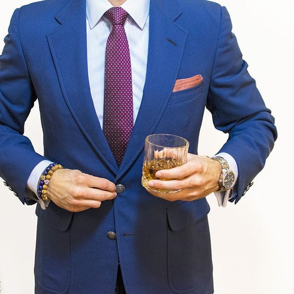
Knitted Ties are at the less formal end of the necktie spectrum, and can be used to dress down a suit or dress up an informal outfit. Given that these ties provide textural variation (knitted) that shows more depth than other tie fabrics, are finished off with square ends, and appear looser (given lack of interlining), these unique pieces of neckwear are ideally worn during less formal events.
Whether you are wearing chinos with a buttoned down shirt and blazer, or a suit to a cocktail party, a knitted tie will be the perfect complement to your ensemble! While silk knitted ties can be worn year round, woolen knitted ties, which tend to be heavier, are best suited for the Fall & Winter Seasons.
To view The Dark Knot's range of stunning, hand made silk knitted ties, please click here.

A knitted tie provides the perfect balance of dapper and textural variation! Courtesy of blog.trashness.com

Summary
Ok, so that was a lot of information! Well, I wanted to be as comprehensive as possible, given that our brand is largely geared towards helping gentlemen mix and match ties to their suits and shirts. Here’s a recap of what we have comprehensively gone over in this article:
- Matching ties to your suits and shirts requires closer inspection of three critical components: color theory, pattern mixing and tonal considerations
- When matching colors, a color wheel is a strong foundation upon which to understand the essentials. A color wheel is largely divided into two categories of colors; warm and cool colors. Warm colors exhibit more vibrance (red, orange and yellow), while cooler colors represent more calm (blue, green and purple). The goal of using the wheel is to create harmony, or balance, with respect to colors in your suit, shirt and tie ensemble.
- A complementary color scheme creates the most contrast, as it pairs colors directly across each other on the wheel (e.g a blue shirt with an orange tie). A triadic color scheme creates contrast but less striking than a complementary color scheme (e.g blue shirt with a red tie). A monochromatic color scheme provides the least contrast as one is using tints (lighter variants) and shades (darker variants) of the same color (e.g a navy tie against a light blue shirt). The reason this creates the least contrast is because one is using colors that are both on the ‘cool’ spectrum.
- When matching tie patterns to your suits and shirts, there are two key components to pay attention to: pattern type and pattern proportion. Pattern proportion is the most critical. If you are pairing two patterns, whether they are different or similar (e.g a striped tie against a striped shirt), it is essential that pattern proportion / scale differ so as to create contrast (e.g a pinstriped shirt with a wider striped tie).
- When first starting out with finding the right tie pattern, it is best to begin with one striped article in your outfit, and work your way up as you become more comfortable.
- When choosing an appropriate necktie, you can create the most visual contrast by picking a shirt with a smaller scale pattern, paired with a tie with a larger scale pattern. In this instance, your tie will be your statement piece.
- Conversely, you can create contrast and make your shirt the statement piece, by choosing a larger scale shirt pattern and small scale tie pattern.
- Pairing a low tonal shirt (muted and appears as one color / pattern from afar) with a higher tonal tie (clearly shows more than one color and a stronger pattern from afar) will help you create strong visual contrast, while exuding an elegant look.
- Pairing a high tonal shirt with a lower tonal tie will create less of a visual contrast, and is best suited for bolder dressers who like to wear a statement shirt.
- When evaluating different necktie fabrics, aesthetic appeal as well as insulation properties of fabrics should be taken into account.
- For Spring & Summer Months, Printed Silk Ties, Cotton Ties & Linen ties will be your ideal choices. It is important to watch out for higher quality cotton & linen ties that have adequate interlining, so that they are not prone to wrinkles and retain their shape over time.
- For the Fall & Winter Seasons, Silk & Woolen ties are your best complement. They will add a subdued look, generally with earthy colors. This, in addition to the rich textural variation provided, will offer the best finishing touch for your suiting ensembles during the colder months of the year.
- Knitted Ties are versatile pieces of neckwear that can be used to dress down a formal outfit or dress up a more casual outfit. While they should be avoided for the most formal occasions, the textural and aesthetic variation that they provide with their knitted fabric, lack of interlining and square ends, will add an element of intrigue and aesthetic appeal to any outfit you are wearing when you are out in a social setting!
Thanks for having read through all of this! Hopefully we have been able to help you better understand the basics of color and pattern theory and how to put together your next suit ensemble!
Are you looking for a range of foundational ties to build out your wardrobe? Please feel free to view our Essential Ties Collection!